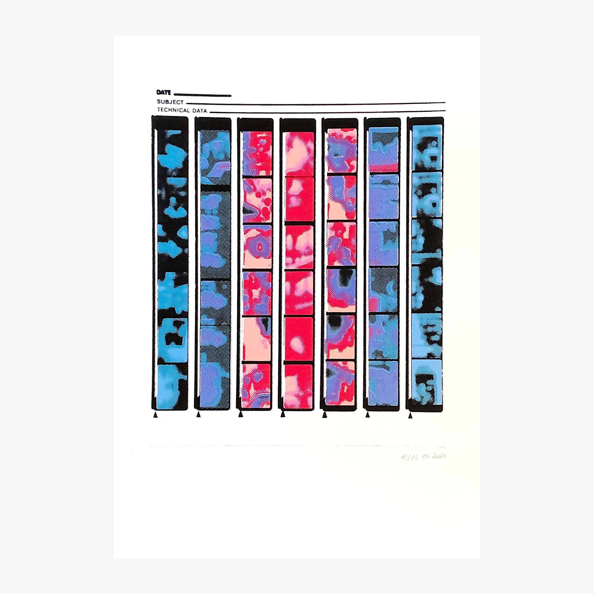
Contact Sheet. Limited edition of 15 screenprints on paper.
2020
Back in my student days I often developed photos myself, in an improvised bathroom photo lab. I have kept some badly conserved photos from these days, and a couple of contact sheets.
For those of you who don’t develop photos, a contact sheet is a grid of thumbnail versions of all photos on a negative, used to decide which ones to blow up and develop at a bigger size. They always held a sort of promise in my mind, a way for my amateurish photos to become part of a formal process, the rigour of which I thought was synonym with professionalism.
I like the format of a contact sheet; the photos themselves become almost adjacent to the framing, the text on the edges. I wanted to keep the format and make the photos even more inconsequential so I blurred them beyond recognition, and added colour in a way that pushes them from narrative frames into abstract forms.
Printing it was not an easy job- I wanted the colours to mesh in blurry gradients, and in places they came in too neat, too separate, so I had no choice but to add more layers, blur it even more. In the end it took 9 layers to get the glorious mess of colours I was after, framed by strong black lines into an unreadable story.


